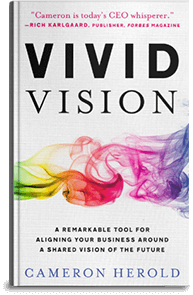
 Some companies I have coached on creating a Vivid Vision (formerly Painted Picture) have done an amazing job.
Red Balloon Days in Sydney, Australia, did a great job with their Vivid Vision. They made it jump off the page by having a designer use creative typography–cool fonts, animation, colors and varied type sizes–to keep the reader engaged and excited. Email me if you’d like to read it.
Nurse Next Door in Vancouver, Canada, did a brilliant job constructing their Vivid Vision. They brought it to life by creating a simple PowerPoint slide show complete with audio where co-founder Ken Sim reads out the Vivid Vision while it’s being highlighted with photos and graphics. The visuals are an excellent feature, and get the reader engaged while anchoring ideas. I wasn’t a huge fan of the Tina Turner song they used (Kidding! Sort of) – but loved when they shared their Vivid Vision on YouTube.
Sebastian Tondeur, the CEO of MCI based in Geneva, filmed a fantastic introduction to his company’s Vivid Vision. He stood in front of a green screen, and then had company graphics inserted. He explained what the Vivid Vision was and why he’d written it. Sebastian’s company was operating in twenty-five countries when I helped him write the Vivid Vision. Afterwards, he brought me to a company meeting to meet with the leaders of each country’s division so I could explain the idea behind the concept of a Vivid Vision to them. It was a great way to introduce the idea and instantly start to trickle it down to all eight hundred employees.
All of the Vivid Vision Hall of Famers did exactly what you’re supposed to do with the exercise: they pushed beyond the drab corporate-speak and confining metrics, and answered the simple question, “What’s really possible for our company?”
See your Vivid Vision as the ultimate opportunity to make your company shine.
